The SAL is more than just membership; it actively contributes to programs supporting children, youth, and veterans. Through fundraising events and volunteer efforts, SAL members make a positive impact in their local communities.
Together with The American Legion and The American Legion Auxiliary, they form the Legion Family, working towards common goals and values
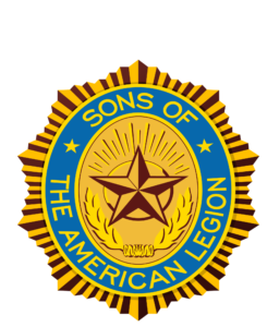
The emblem of the Sons of The American Legion (SAL) carries significant symbolism.
-
Star in the Center: This star represents our country, the United States of America.
-
Five Points of the Star: These points symbolize the five-point program of the SAL. While the specifics of this program may vary, it generally encompasses areas such as patriotism, service, and community involvement.
-
Sun in the Background: The sun represents the SAL itself, and its rays signify the loyalty of its membership.
-
Blue Color: Just like the blue in our flag, the blue of the emblem stands for justice.
-
Two Stars in the Blue Border: These stars represent freedom and democracy.
-
Wreath Below the Star: The wreath serves as a memorial to our comrades and forefathers who willingly sacrificed their lives for our country.
-
Ten Points of the Emblem: These ten points correspond to the ten ideals that every American Legion son upholds.
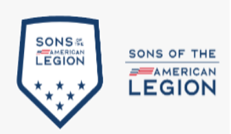
The Sons of The American Legion brand mark was created to address the need to modernize the Sons of The American Legion brand to appeal to the next generation. Moreover, the new brand mark takes into consideration a host of applications that the original emblem could never have anticipated. Those include digital and social media, special event and sports marketing, lifestyle apparel and more.
The brand mark is to be used in all marketing communications applications, while the emblem should be reserved for official documents and communications.